Atlas.
Atlas is a mobile experience designed to help travellers uncover destinations aligned with their unique interests, preferences, and travel style. Over several months, I led end-to-end design across UX research, interaction design, visual design, and prototyping — developing a platform that turns exploration into a personalised, curiosity-driven journey.
Focus
Research-informed concept, mobile product design
Role
Product Designer
Duration
2 months
Tools
Figma
The Challenge
Finding new places to visit often depends on generic travel blogs, influencer lists, or algorithms that prioritise popularity over personal relevance. This creates an exploration gap — travellers struggle to discover destinations that genuinely match their preferences, goals, and travel style.
The goal was to create a product that:
Personalises discovery through user-defined travel interests.
Makes under-the-radar destinations accessible through a simple, engaging interface.
Provides contextual information and local insight within a cohesive flow.
Understanding the Space
To validate the need, I studied current travel-discovery behaviour and market gaps. Recent studies (e.g., Expedia 2024 Travel Trends Report and Skyscanner Insights) show:
71 % of travellers want recommendations that reflect personal interests.
58 % feel overwhelmed by the number of travel options online.
65 % are motivated by discovering lesser-known locations.
These data points reinforced the opportunity for a platform centred on interest-based exploration rather than algorithmic popularity.
Defining the Experience
User Needs
Discover destinations that align with interests (e.g. hiking, architecture, cuisine).
Save and compare locations for future trips.
Receive relevant updates, alerts, and recommendations.
Share insights or chat with other travellers.
Design Objectives
Makes under-the-radar destinations accessible through a simple, engaging interface.
Effortless exploration: an intuitive “Explore” hub connecting users to all core tasks.
Clarity and calm: a visual tone that evokes the serenity of travel itself — gradients, soft blues, and fluid shapes.
Wireframing & Iteration
Problem: Initial Wireframes Felt Overwhelming
My first low-fidelity sketches layered every possible interaction — filters, lists, maps, and preferences — on the main screen. When shown to peers, users hesitated. Presenting all options at once created decision paralysis. This was an overload of paths without a clear hierarchy.
Pivot:
I decided to split cognitive responsibilities across contextual states instead of cramming them together.
I introduced:
A primary Explore hub that focuses strictly on discovery
A secondary Preferences page that handles multi-variable inputs
A Saved Destinations space for later comparison
This separation reduced cross-functional friction and helped users approach tasks at the right time.

Iteration: From Filter Panel to Preference System
The initial Preferences screen exposed every variable at once — sliders, pill toggles, dropdowns, and a primary “Apply” action. While functionally complete, it created cognitive friction. Users had to interpret multiple interaction models simultaneously (range inputs, multi-select tags, single-select dropdowns), which increased decision fatigue before they even began exploring.
Pivot:
Through iteration, I reframed preferences as a modular configuration system rather than a filter panel.
The redesigned version collapses each variable into a summary row (icon + label + current state), allowing users to edit one dimension at a time. This introduced progressive disclosure, reduced surface density, and clarified interaction ownership. Sliders, toggles, and detailed selections now live within focused subviews instead of competing on one screen.


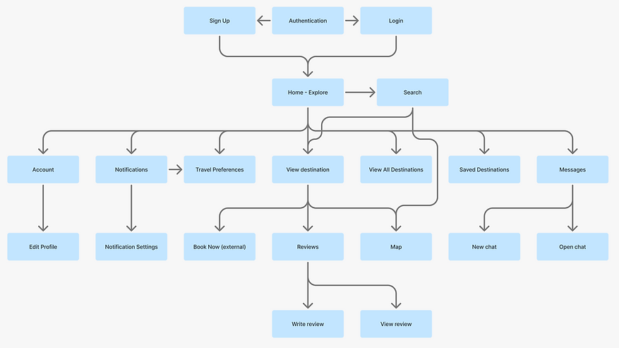
Information Architecture
Key structure:
Authentication: Sign Up ↔ Login → Home Explore
Core navigation: Account · Notifications · Travel Preferences · Saved Destinations · Messages Destination view: overview, map, reviews, and external “Book Now.”
Supporting actions: write / view reviews, edit profile, notification settings, chat.
This structure balances discovery and management, reducing friction between curiosity (“Explore”) and control (“Account,” “Preferences”).
Design Process
Low- to High-Fidelity Exploration
Initial sketches focused on how a user would progress from onboarding to exploration with minimal steps. The final design evolved into a cohesive visual system:
- Gradient onboarding screens that capture the anticipation of travel.
- Personalised Explore feed showcasing recommended destinations with quick filters (Nearby, Most Viewed, Highest Rated).
- Destination pages combining imagery, climate data, and reviews for holistic context.
- Travel Preferences page functioning as the personalisation engine.
- Chat interface for peer recommendations and planning.
Visual Language
The interface combines fluid blue gradients, rounded cards, and airy spacing to reflect openness and tranquillity. Typography follows a modern geometric sans-serif for clarity and warmth.
![[Mockup] iPhone 21.png](https://static.wixstatic.com/media/55e273_643e2b90db3e44b3803b01e06f0c3ee4~mv2.png/v1/fill/w_248,h_500,al_c,q_85,usm_0.66_1.00_0.01,enc_avif,quality_auto/%5BMockup%5D%20iPhone%2021.png)
![[Mockup] iPhone 17 1.png](https://static.wixstatic.com/media/55e273_54b3bef9be2144df99463bbf7eb67866~mv2.png/v1/fill/w_282,h_571,al_c,q_85,usm_0.66_1.00_0.01,enc_avif,quality_auto/%5BMockup%5D%20iPhone%2017%201.png)
![[Mockup] iPhone 18 (2).png](https://static.wixstatic.com/media/55e273_bc0fa0117ef9443883d7b63eba483916~mv2.png/v1/fill/w_282,h_571,al_c,q_85,usm_0.66_1.00_0.01,enc_avif,quality_auto/%5BMockup%5D%20iPhone%2018%20(2).png)
![[Mockup] iPhone 30 (1).png](https://static.wixstatic.com/media/55e273_ef6b7e4637dc4b8681d9f30a70fe868f~mv2.png/v1/fill/w_282,h_571,al_c,q_85,usm_0.66_1.00_0.01,enc_avif,quality_auto/%5BMockup%5D%20iPhone%2030%20(1).png)
![[Mockup] iPhone 36.png](https://static.wixstatic.com/media/55e273_b647e01f5c03407ea6b27c3f828ccf73~mv2.png/v1/fill/w_288,h_582,al_c,q_85,usm_0.66_1.00_0.01,enc_avif,quality_auto/%5BMockup%5D%20iPhone%2036.png)
![[Mockup] iPhone 34 (1).png](https://static.wixstatic.com/media/55e273_8a294821e040477192a7c092c0b4b7ca~mv2.png/v1/fill/w_288,h_582,al_c,q_85,usm_0.66_1.00_0.01,enc_avif,quality_auto/%5BMockup%5D%20iPhone%2034%20(1).png)
![[Mockup] iPhone 27 (2).png](https://static.wixstatic.com/media/55e273_2304df4017964de98e596ccdf3b0a0f7~mv2.png/v1/fill/w_288,h_582,al_c,q_85,usm_0.66_1.00_0.01,enc_avif,quality_auto/%5BMockup%5D%20iPhone%2027%20(2).png)
Prototype & Interaction
Interactive prototypes were developed in Figma to simulate end-to-end journeys: Smooth onboarding transitions and authentication flow. Scroll-based destination reveal animations. Lightweight modal transitions for reviews and settings. This approach allowed rapid validation of flow clarity and motion rhythm.
Testing & Validation
A small round of concept validation was performed through informal user walkthroughs and secondary research synthesis.
Key learnings included:
Users valued visual immersion (large imagery and gradients increased engagement).
Preference-driven filters were more meaningful than generic search.
Clear signposting (“Explore,” “Saved,” “Map”) improved confidence and reduced drop-offs.
These findings guided micro-interaction refinements and content hierarchy adjustments.
Outcome
Atlas successfully demonstrates how personalisation and simplicity can reshape digital travel discovery.
Streamlined flow reduced average task steps from 6 → 3 compared to typical itinerary apps.
Early testers described the interface as “calm, effortless, and visually immersive.”