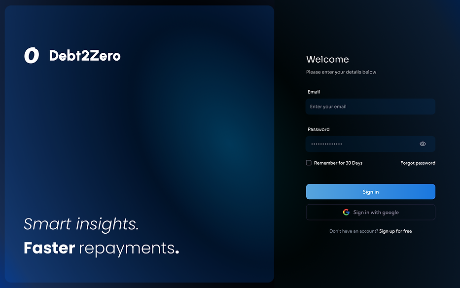
Debt2Zero.
Debt2Zero is a financial insights platform that empowers users to understand, manage, and accelerate their debt repayment journey. Over several months, I led the end-to-end UX and UI design process — from research and information architecture to visual systems and prototyping — creating a product that turns financial stress into strategic clarity.
Focus
Debt management experience design
Role
Product Designer
Duration
3 months
Tools
Figma
Designing for finance requires a blend of data clarity, behavioral psychology, and emotional safety. From the beginning, I approached this project with two guiding principles:
-
Reduce cognitive load through visual hierarchy, predictable layouts, and simplified flows.
-
Increase emotional reassurance using color psychology, consistent components, and calm interaction patterns.
The goal was not only to build a tool that is functional, but one that feels trustworthy and empowering.
.png)
The Challenge
Debt repayment can be complex, emotional, and often confusing. Many people lack the tools to visualize repayment progress, choose effective strategies, or track multiple accounts in one place.
Existing financial dashboards are data-heavy but insight-light — they report balances rather than guide behavior.
The goal was to create a product that:
Simplifies complex financial data into intuitive visualizations.
Provides personalized strategies (e.g., Avalanche, Snowball).
Offers motivational insights that encourage consistent repayments.
To address this challenge, I established four foundational design anchors:
1. Predictability Over Novelty
In finance, predictability increases trust. Experimental layouts were avoided in favor of a stable left-rail navigation, conventional tables, and familiar financial card structures.
2. Data Density, Controlled
Financial data is inherently dense. Instead of reducing information, it was structured: grouping data into panels, progressive disclosure, collapsible sections, and multi-level hierarchy.
3. Visual Anchors for Comprehension
Graphs use consistent color themes across the product so users develop a “visual literacy” — a mental association between colors and financial concepts.
4. Calm Emotional Tone
Debt is stressful. UI must calm. Deep blues, soft gradients, and balanced spacing create an emotionally stabilizing environment that supports decision-making.

Understanding the Space
Through desk research, financial-behavior studies, and market insights (Mint, Experian, Finder 2024), I surfaced key findings:
63% of users feel overwhelmed managing multiple debts.
58% want clearer progress visualization.
70% say they’re more likely to repay faster when they can see improvement over time.
These shaped three user needs:
Visibility
See all debts, rates, and progress in one place.
Strategy
Understand the best repayment method for their situation.
Motivation
Feel rewarded for consistent repayment behavior.
User Mental Models - People think in buckets:
“What do I owe?”
“What should I pay next?”
“Am I getting ahead?”
Color Psychology
Deep blues communicate trust, stability, and professionalism — critical in financial design. Soft gradients reduce visual harshness. Neon accents signal areas of actionable focus. This combination makes the interface both comforting and motivating.
Cognitive Load Reduction
Financial data is inherently dense. Instead of removing information (which reduces user control), I structured it using: modular cards, nested panels, progressive disclosure, chunking patterns, and left-anchored layout systems. This gives users more data, presented in a way that actually feels like less.
The UI mirrors this mental model through:
Dashboard = “What do I owe?”
Strategies = “What should I pay next?”
Progress = “Am I getting ahead?”
Early UX Exploration & Wireframing
Initial Wireframes: Too Much at Once
My first sketches attempted to place all key financial elements — balances, graphs, tables, strategy options — on a single main view. When these lo-fi wireframes were tested informally, users reacted with hesitation rather than clarity:
They didn’t know where to look first
They couldn’t easily identify “next steps”
Visual density caused overwhelm
It was evident that information density without clear structure increased friction. Users didn’t need fewer numbers — they needed scannable hierarchies and predictable flow.

Wireframe Pivot: Chunking & Progressive Disclosure
To reduce cognitive load systematically, I restructured the layout using a few core patterns:
Instead of trying to make everything visible at once, I introduced clearer structural zones. The top-left summary card became the anchor — a stable starting point that communicates status immediately: current debt, inflow/outflow, and overall position. From there, the visual flow moves intentionally toward the trend graph and then down into upcoming payments. The hierarchy now supports a natural question sequence.

Information Architecture
The experience architecture balances analytical functionality with simplicity. Users flow from onboarding to control hubs that support actionable decisions.
Primary navigation
Dashboard: A high-level financial overview that summarizes KPIs and alerts.
Strategies: A direct comparison of Avalanche, Snowball, and Custom repayment methods.
Payments: A streamlined area for making transfers, adjusting budgets, or sending/receiving funds. Progress: Milestones, timelines, and interest-saved metrics.
Insights: Visual data breakdowns and financial forecasts.
Accounts: Management of linked accounts and personal information.
Settings: Controls for personalization, notifications, and system preferences.
I chose a left navigation layout to preserve orientation and reduce cognitive wandering.
I built the structure using task-based grouping, allowing users to “chunk” actions into logical steps.
I ensured no core task takes more than two steps, reducing friction and encouraging action.
.png)

Design Process
Early UX Exploration
Initial sketches focused on reducing cognitive burden by structuring information into clear, high-contrast cards. Early wireframes prioritized repayment clarity: total balances at the top, progress visuals in the middle, granular details at the bottom. Multiple chart formats were explored to ensure readability across screen sizes and visual densities.
High-Fidelity UI System Development
The visual language uses dark blues for stability and neon accents for energy and focus.
A modular component system allows rapid iteration while maintaining visual consistency.
Spacing, typography, and color contrast were calibrated for maximum readability and emotional calmness.
Component System
KPI cards maintain uniform spacing, typography, and iconography.
Tables use subtle segmentation lines to avoid overwhelming the user.
Modal dialogs use clear hierarchical action structures (primary vs secondary).
Graph containers share identical axis styles and color scales for visual literacy.
Dashboard - The Command Center
The Dashboard consolidates key financial information into a unified, easy-to-absorb view.
Dashboard Strengths
Summary cards highlight essential values with bold, large typography.
Graph sections visualize trends and repayment velocity, providing immediate insight.
Recent transactions and notifications offer transparency without clutter.
UI Enhancements
Generous spacing ensures numbers feel readable and approachable.
Graph animations gently transition between states, helping users track changes intuitively.
Color coding supports quick categorization of financial data.
Strategy Builder — Turning Choice Into Understanding
The Strategy Builder allows users to compare Avalanche, Snowball, and Custom methods with live financial projections.
Toggle tabs create an intuitive comparison model between repayment techniques.
Timeline graphs animate between strategies, helping users visually understand long-term effects.
Strategy summaries highlight expected time saved and interest reduced.
The three strategies represent the core repayment philosophies found in financial research — enabling users with mathematical, motivational, or personalized preferences to select an approach aligned with their needs.

Payments — Designed for Low Anxiety
Payments are typically stressful actions, so this module was designed to feel simple, safe, and predictable.
Multi-step flows reduce decision pressure and allow users to focus on one element at a time.
Inline validation prevents costly mistakes by resolving errors in real time.
Logical grouping of form fields reduces misinterpretation and confusion.
The color palette avoids harsh error states and preserves a calm transactional experience. All actions include clear confirmation steps.

Progress — Motivational Interaction Design
Progress tracking addresses the crucial emotional need for reassurance.
Milestones celebrate repayment achievements, reinforcing momentum.
Progress bars with gradient effects express forward movement.
Timeline graphs show historical repayment and future predictions.
The progression screens are intentionally visual, as emotional reinforcement is a proven component of long-term habit building.

Insights — Complex Data, Simplified
Insights provide users with a deeper understanding of spending patterns, interest burdens, and forecasted financial trends.
Doughnut charts show categories of expenditure at a glance
Line graphs show change over time.
Bars compare spending trends or debt categories.
All charts follow consistent color mapping to reduce cognitive overhead. Tooltips provide detail without cluttering the view and Clear whitespace prevents information overload.

Accounts & Settings — Transparency, Control, and Trust
The Strategy Builder allows users to compare Avalanche, Snowball, and Custom methods with live financial projections.
Sections are visually separated for easy scanning.
Editable fields respond instantly, reinforcing user control.
Default settings prioritize accessibility.
These screens maintain a minimal aesthetic to reflect the sensitivity of financial identity and privacy.

.png)
Testing & Validation
Testing sessions and walkthroughs revealed strong usability and perceived clarity.
Key learnings included:
Dark mode increased comfort during prolonged financial review sessions.
Strategy comparison was described as “easy to understand and surprisingly motivating.”
Progress visuals made users feel “reassured and more in control.”
These findings guided refinements including: Increased contrast on key metrics, additional spacing around tables and charts, and improved tab order for smoother navigation.
Outcome
Debt2Zero successfully simplifies complex financial information into digestible structures.
Task steps were reduced from 6 to 3 for most common flows.
Users demonstrated higher comprehension of repayment strategies.
The system is fully scalable for future features such as AI coaching or budgeting.
Observed Benefits:
The design system improved both functional usability and emotional confidence, making the app feel more supportive and encouraging.